Brand Guide
Graphic Elements
Graphic elements support the messaging and help bring the brand to life. These elements are recognizable textures, treatments and graphics that accent the typography, color and photography.
This brand leans heavily on depicting the idea of flight with ethereal and grainy textures, gradients and elegant strokes.
All elements are available in the brand toolkit, which can be downloaded from the photo and asset library. If you have questions, please contact brand@udayton.edu.
These images are photographic representation of flight. These should predominately be used as background textures within a composition or can be masked into a composition accompanying other photography.

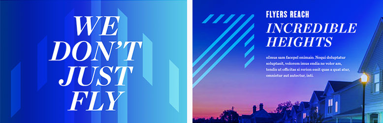
Gradients are one representation of light. They are used as a primary element in most pieces and are a crucial way to communicate the brand look.
Three gradients are provided in the brand toolkit; custom gradients can be created in Photoshop by using a large, soft brush with the approved color palette.

Gradient and noise overlays can work over backgrounds, photography or headlines.
This effect can be created in Photoshop by using a large, soft brush and applying the dissolve blending mode on top of it. To get a blurred effect, rasterize the dissolved layer, change the blending mode to normal and apply a slight motion blur to it.

The motion blur effect can be applied using one of the premade files from the brand toolkit, or it can be created in Photoshop by applying the motion blur filter. When applying the filter, ensure the angle of the blur is at 45 degrees.

The diagonal strokes can be used as a background element, to draw the reader's eyes to specific copy or as a border. The lines should always be at a 45-degree angle.
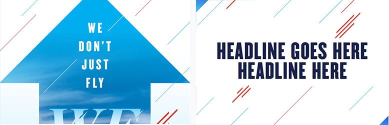
The arrow graphic can be used as a background or accent element. The arrow can be used upright or at a 45-degree angle.
Borders bring a sense of focus and elegance to a composition, drawing the eye to photography or language. A 45-degree triangle should be used on one of the corners.

Based on stained glass in UD's chapel, this intricate pattern adds visual interest and dimension to backgrounds. It can also stand alone in place of an image.
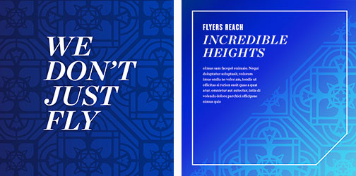
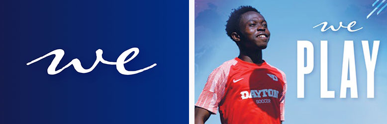
When using "we statements" (e.g., "we learn," "we lead," "we serve," etc.) on materials, the "we" graphic element can paired with the verb to add a more humanistic and warm element.
The graphic "we" can be downloaded from the brand toolkit. The verb should be set in Champion uppercase.
URL
The URL should always be written in lower case: udayton.edu/wesoar.
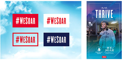
Hashtag
The campaign hashtag can be used as a footer element. Using this container reinforces the name of the campaign and drives consistency for social posting. It should always be used in a solid or outlined container in glow red, glow navy or white.
If used in text and not as a graphic element, it should be written in camel case (#WeSoar).