Brand Guide
Comprehensive Campaign
United by our call to learn, lead and serve, we explore beyond the boundaries of human knowledge to make the world a better place. Since 1850, we have challenged the status quo, championed human rights and developed advanced technologies that positively impact our world. Our institution has gone to incredible heights, and when we come together, we soar.
Overview
To ensure a future of excellence and become the best UD we can be, we must build a culture of philanthropy, driven by participation and engagement.
Who We Are
Nearly everyone who spends time on our campus will attest that UD is a special place. But more importantly, UD stands for something — a higher purpose. We have a strong mission and identity as a Catholic, Marianist university that informs all we do.
What We Do
UD provides a top-tier Catholic, Marianist education that results in high graduation and job placement rates. However, what makes UD unique is our approach to education. True to our Marianist values, we educate the whole person — body, mind and spirit. We not only prepare students for a career, but we also help them find their vocation and purpose and provide them with opportunities to make a difference in the world.
Where We Are Heading
Our past informs our future. UD was founded by immigrant sons and daughters of humble means. In that tradition, we must make a UD education more accessible and ensure a collegiate experience hallmarked by quality faculty, innovative programs and world-class opportunities to put knowledge into real-world practice.
To support our students today and build the foundation for an even more successful future, UD's comprehensive campaign has engagement, participation and philanthropy goals.
Explore Campaign Goals
To skyrocket our community to new heights, we are raising funds for three priorities:
- Student Access: Create robust scholarship programs to assure access to talented students.
- Hands-on Learning: Expand hands-on learning opportunities — for all students — on campus, in the community and around the world.
- Academic Innovation: Invest in great faculty and innovative programs that enrich the student experience.
Explore Campaign Priorities
The campaign name (We Soar) should never be split up or altered when referring to the campaign itself. For example: "With the continued success of the We Soar campaign, we will elevate our community to incredible new heights."
However, variations on the phrase "We Soar" can be used in conceptual headlines and body copy as long as the correct phrase is also on the piece (e.g., "WE BUILD. WE HEAL. WE SOAR.")
Avoid altering the campaign name, substituting words or changing the tense when the phrase appears on its own.
Campaign Wordmark
The campaign wordmark depicts the name of the campaign with diagonal cuts and lines, which illustrate the idea of taking off. The campaign wordmark can be used without the campaign descriptor in cases where space is limited or they will be used separately (e.g., if the wordmark is on the front of a postcard, the descriptor can be placed on the back).
The mark can be used in Flyers Blue on light-colored backgrounds or in knockout on dark backgrounds. The campaign wordmark can be formatted vertically (stacked) or horizontally; use whichever one works best in the space.
Stacked Wordmark
For legibility, the stacked wordmark should be at least 1" or 75 pixels wide.
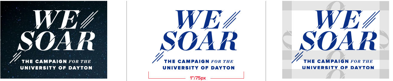
Horizontal Wordmark
For legibility, the stacked wordmark should be at least 1.25" or 90 pixels wide.

Clear Space Requirements
To avoid visual confusion, the wordmark should be set apart from other visual elements (copy, photos, graphics, etc.). The clear space should be half the height of "O" in "SOAR".
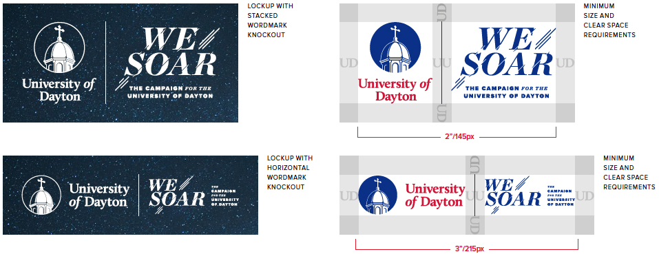
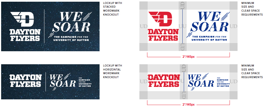
The chapel logo can be paired with the campaign wordmark to amplify brand recognition. When the marks are paired, the University logo should always appear first, and space requirements should be followed. You may also use the two marks separately (e.g., one on the front of the piece and one on the back; one at the top of the piece and one on the bottom).

If a department or program wishes to use their secondary or tertiary lockup, it cannot be paired with the campaign wordmark. Rather, the marks should be placed separately, as previously described.
All uses of the University's logo must follow the logo guidelines, and permission must be obtained prior to using the logo. To request permission, submit the logo request form.
Minimum Size Requirements
For best legibility, the campaign wordmark should be at least 2" or 145 pixels wide.
Clear Space Requirements
To avoid visual confusion, the wordmark should be set apart from other visual elements (copy, photos, graphics, etc.). The clear space should be the width of the "U" and "D" in the institutional logo.
The athletics logo can be paired with the campaign wordmark to amplify brand recognition. The athletics logo should always appear first, and space requirements should be followed.The two marks may be used separately (e.g., one on the front of the piece and one on the back; one at the top of the piece and one on the bottom).
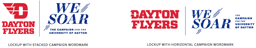
The Dayton Flyers logo is only to be used on materials promoting the athletics division and Dayton Flyers teams, unless written permission is granted by University Athletics and University Marketing. The institutional logo should be used in all other cases.
Minimum Size Requirements
For best legibility, the campaign wordmark should be at least 2" or 145 pixels wide.
Clear Space Requirements
To avoid visual confusion, the wordmark should be set apart from other visual elements (copy, photos, graphics, etc.). The clear space should be the width of the "U" and "D" in the institutional logo.
The campaign descriptor connects the campaign to the University of Dayton. In rare cases, the descriptor can be used independently when the campaign wordmark is also being used within the same piece (e.g., if the wordmark is on the front of a postcard, the descriptor can be placed on the back).
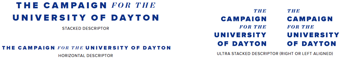
The campaign descriptor can be used stacked, ultra stacked or horizontal providing options depending on space available. To ensure legibility and consistency in appearance, the campaign descriptor should always appear in Flyers Blue or white (knockout).
Minimum Size Requirements
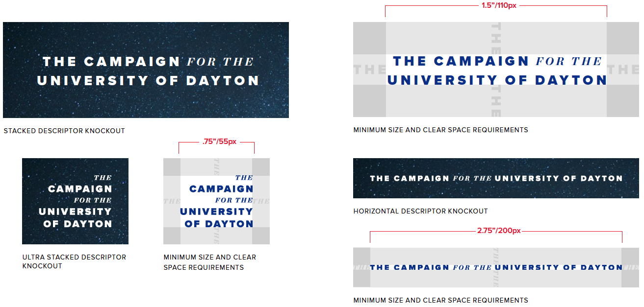
For best legibility, the campaign descriptor should follow minimum size requirements:
- Stacked descriptor: 1.5" or 110 pixels wide
- Ultra stacked descriptor (left or right aligned): 0.75" or 55 pixels wide
- Horizontal descriptor: 2.75" or 200 pixels wide
Clear Space Requirements
To avoid visual confusion, the wordmark should be set apart from other visual elements (copy, photos, graphics, etc.). The clear space should be the width of the word "THE" in the campaign descriptor.
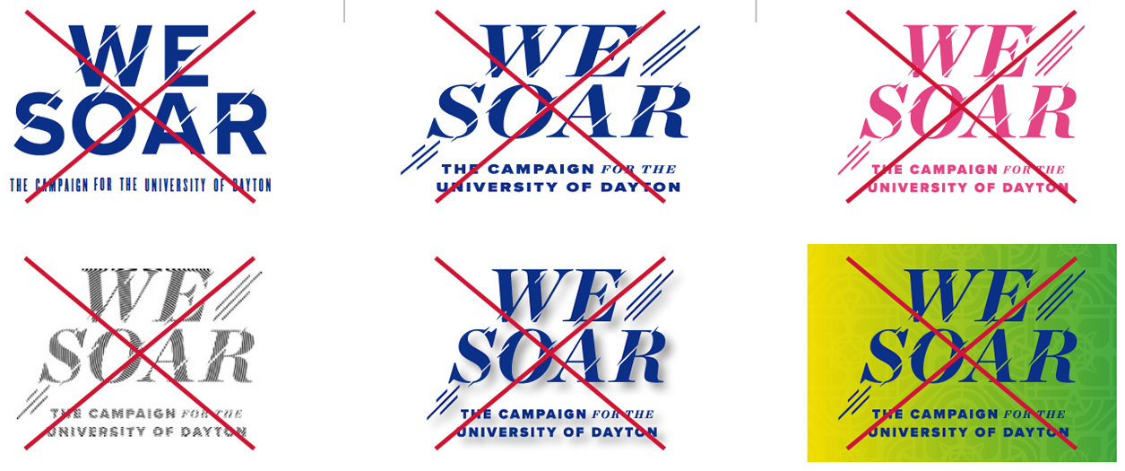
The campaign wordmark may not be altered in any way. This includes, but is not limited to:
- Never change the fonts in the wordmark or campaign descriptor.
- Never change the proportion of the campaign descriptor when paired with the wordmark.
- Never change the layout of the logo.
- Never stretch or skew the logo.
- Never change the color, except for the approved variations.
- Never use a pattern in the logo.
- Never stylize the logo.
- Never use the logo on a background that clashes or makes it unreadable.